Design Methods Assignment 2:
Creating a Main Menu Screen for Dark Souls
Looking at the Actual Game’s Menu
Between Fantasy / Sci-Fi or Sports, I decided to go with fantasy as it is my favourite gaming theme and I chose to make the main menu screen for Dark Souls.
I chose this game because I personally felt it has strong aesthetics which immersed me into the game. After having played the game I feel like I had learnt a lot about how to use aesthetics in games; which start from the very first screen: the main menu.
To get an idea of how to approach making a main menu for Dark Souls, I took a look at the main menu of the actual game.
I noticed that it has no image, only a black background representing the dark theme of the game. It also shows the game’s title in the middle, glowing brightly, contrasting with the dark background.
The game title text is given an ominous feel with several odd looking signs scattered around it.
The options are displayed as simple text, and have an orange background colour when selected.
Overall the idea of this menu seems to be focusing on clarity and simplicity while staying consistent with the game’s aesthetics.

Image referenced from:
Gathering Ideas From Other Fantasy Games
To get more ideas of how to make a game menu, I looked at other fantasy themed games that I know of. I decided to start my research with Final Fantasy VII’s main menu.
The menu is extremely simple, the background image shows only the main character’s weapon under a single ray of light. The menu only has two options, ‘New Game’ and ‘Continue?’
It seems the idea behind this was to show a meaningful object from within the game in the background and have the two options being the player’s focus.
Personally I feel this is over-simplistic, however it is clear and serves its purpose. I like the idea of showing something from within the game which is meaningful to the player. I feel that the menu does not look professional due to the lack of consistency in the two options; one option is in full uppercase while the other is not.

Image referenced from:
* * *
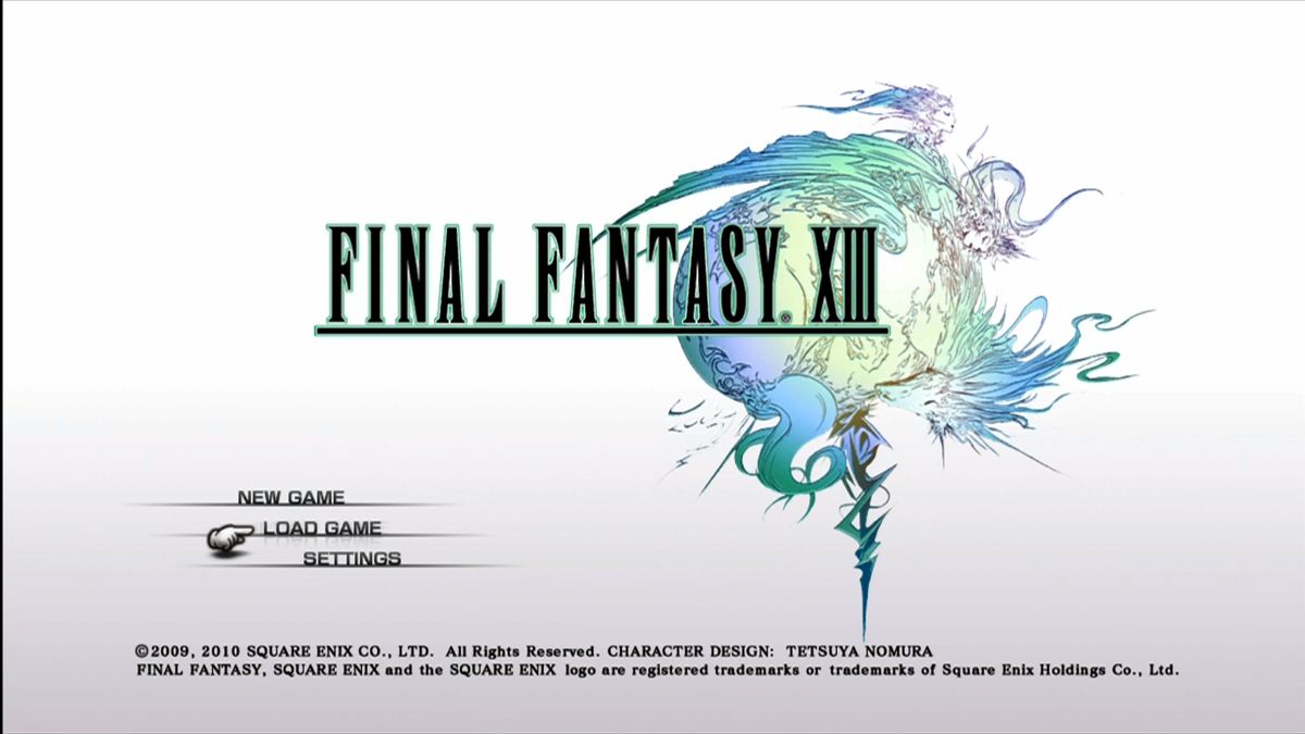
Next I looked at another final fantasy game which was released much later. I chose to look at Final Fantasy XIII’s main menu.
In contrast with the previous example, this game’s menu shows the game’s name, and the game’s logo rather than a game object.
The rest of the background is a gradient from grey to white and the menu options are placed neatly to the side. I noticed that final fantasy like using a pointing hand cursor to show the currently selected option.
This menu has a clean and simple interface; letting the player focus on the few important options, I personally feel this is an elegant style for a menu.

Image referenced from:
* * *
Finally I took a look at Dragon Age Origins; another of my favourite fantasy themed games. The first difference I
noticed from the previous examples was that this menu has a full screen background image, rather than a single image of a game object or logo.
The image being used gives the perfect feeling of the atmosphere in which the game is played. The focus is on a blood stained sword sticking into the ground, suggesting the battles that lie ahead in the player’s path through the game.
The menu also makes use of a stone coloured custom font for the title and another similar shaped, white font for the menu options.
When a menu options is selected, the text glows brighter and gets a darker background.
I like how it feels like I’m looking at the path that the game’s characters have to go through when I look at the background image.

Image referenced from:
Noticeable Elements
- A custom font for the game title.
- A simple interface, with easily readable text for the options.
- A clear effect showing which option is currently selected.
- The background image is often related to the something from inside the game world.
- Consistency looks good.
- The game title is always above the menu options.
Choosing a Meaningful Background for Dark Souls
Dark Souls is a dark game with aesthetics that are meant to make players mainly feel two things: Loneliness and Paranoia.
Players take the role of an 'undead' being, left free to explore a number of areas of an unforgiving world, with death lurking behind every corner.
Through these negative aesthetics, players get immersed in the experience and learn to appreciate every bit of help they can get.
At several points in their adventure, players find bonfires which act as checkpoints and are also safe zones. Given the nature of the game, it makes bonfires feel an oasis in a desert.
On top of replacing the feeling of paranoia with relief, some of the loneliness is also dispelled as you can only see other players (if playing online) while resting at a bonfire.
All of this gives bonfires a great positive feeling, thus making them an extremely meaningful part of the player's experience.
For this reason I want the background of the main menu to be a representation of the player’s character reaching out to a bonfire while surrounded in darkness. I believe players who are playing the game would relate to and appreciate this image, whereas players who have not yet started are instead left with a mystery as to what the bonfire signifies.
Luckily, I found a perfect image to refer to, for drawing the background I had in mind.

Image referenced from:
Menu Structure & Options
Seeing how much importance has been given to the menu options in the previously mentioned examples, I would prefer to keep them in the middle of the screen for prominence over everything. However if the background image was directly behind the menu options, the text would be less clear. For this reason I think it would be best to have the bonfire to the side, with the rest of the image fading out into darkness.
Depending on how much the background interferes with the menu options, I will have to decide between having them in the center of the screen or at the opposite side of the bonfire which will be completely dark.
The game title will be centered, in the upper half of the screen, with a dark background behind it and will have a custom font to fit the dark theme.
The menu will consist of three options: ‘Continue’, ‘New Game’ and ‘Settings’. An option to exit game would also be required if this game is to be run on an iPad rather than a console.
As Kirk Hamilton says in his post about ‘The Ten Commandments Of Video Game Menus’, it is very important to have the continue button as the first option, and also have it being the default selection. This should be obvious in all game menus since the continue option is by far the one that will be used most.
Referenced from: http://kotaku.com/5955855/the-ten-commandments-of-video-game-menus
Concept Work
Concept #1
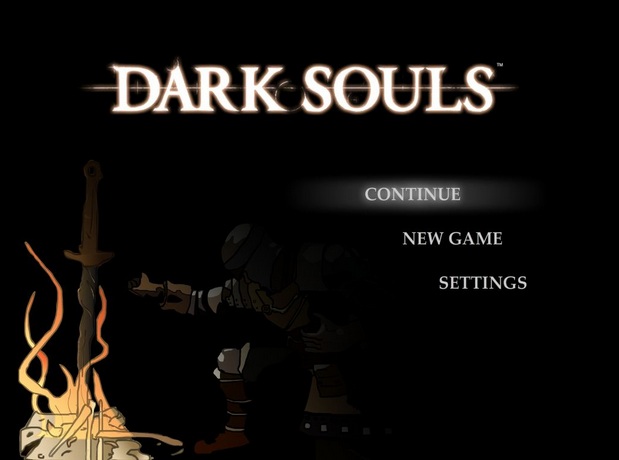
Comments:
In my first attempt, I placed the menu options to the side, similarly to Final Fantasy XIII’s style. My intention was to have the options completely on a black background to maximize the contrast of the text in order for it to maintain prominence over the background.
I also added a glow effect for the selected menu option that I saw fitting for a light and dark themed game. Next I used the original Dark Souls title to get a better idea of the menu overall.
Still I was not quite convinced having the menu options on the side would look best, so I shortly moved on to my next concept.
Concept #2
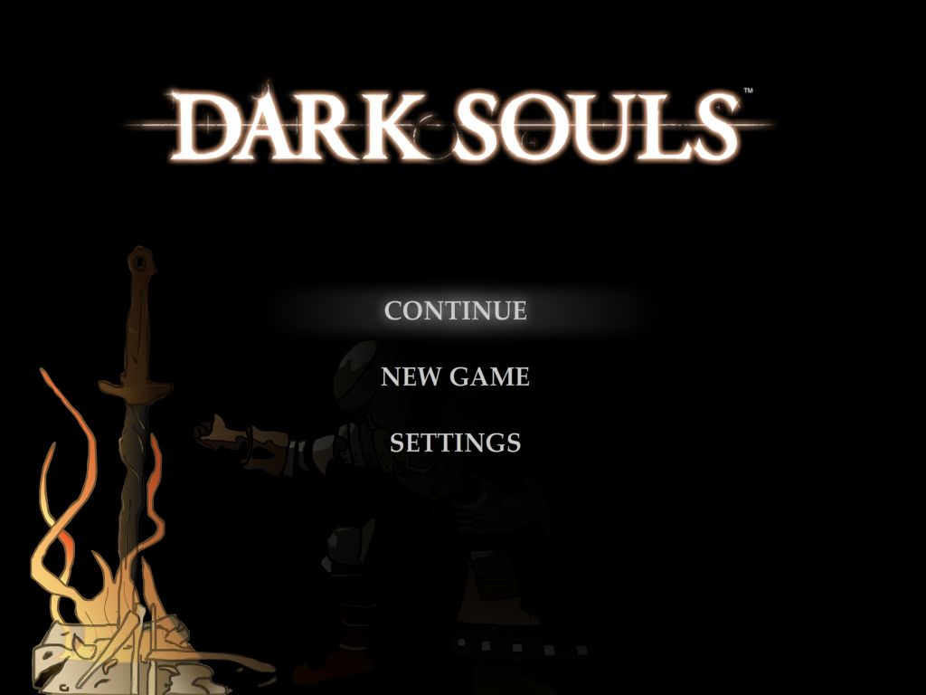
Comments:
In the second concept, I moved the menu options to the center of the screen, and darkened the character in the background in order to keep the options the focus of attention.
Seeing how the background hardly interfered with the menu options, I felt this version looked better and decided to stick with this version, however the bonfire on the left was too bright and was getting too much focus regardless of being on the side. Thus my next step was to make the bonfire look less important.
Final Concept
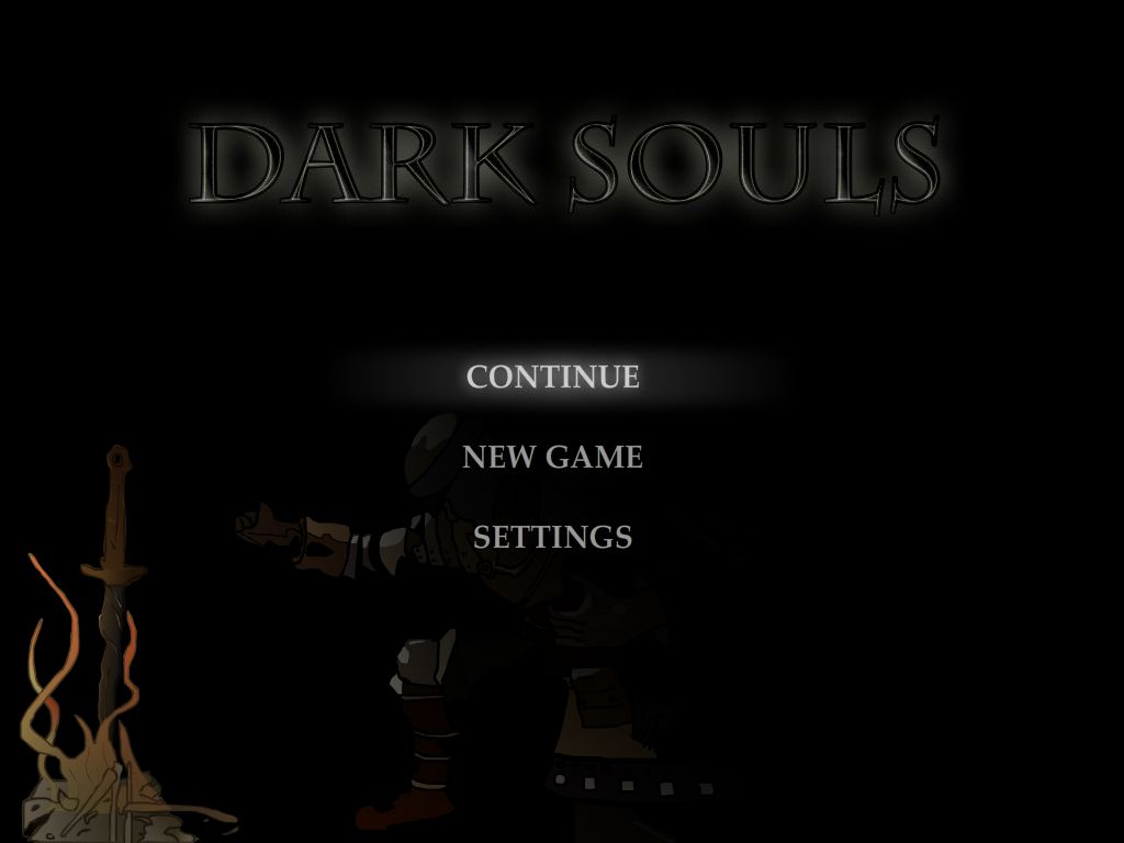
Comments:
As planned, I darkened the bonfire and made it smaller which brought the main focus of the menu screen back to the menu options.
Next, I did some minor improvements to the background art and slightly darkened the unselected menu options.
Finally I replaced the original game title with a custom font which fits in with the rest of the menu options. As opposed to the actual game’s menu, my concept has a few more things in the background, so I felt it would make sense to take away some of the brightness from the game title, and make it darker to fit in with the rest of the background.
Bibliography
Dark Souls Main Menu Reference
Final Fantasy VII Main Menu Reference
Final Fantasy XIII Main Menu Reference
Dragon Age Origins Main Menu Reference
Kirk Hamilton’s Post: ‘The Ten Commandments Of Video Game Menus’
Dark Souls Bonfire Reference
solar lights outdoor garden
ReplyDeletesolar light outdoor
solar garden lights outdoor
solar pathway lights outdoor
solar landscape lights outdoor
solar yard lights outdoor
solar garden decorations
solar garden stakes
solar stake lights outdoor
solar stakes decorative
Click here for Best Solar Lights Collection Storefront
Sogrand Industry, Inc
15 Years Solar Light Manufacturer
Directly Sells on Amazon